

V-Carving Explained: How One Bit Carves Hairlines and Bold Strokes
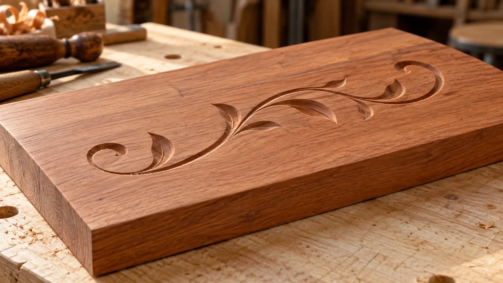
Try routing small lettering with a flat end mill and you find out fast why sign makers do not do it that way. The serifs vanish, the inside corners come out rounded, and the thin strokes are narrower than any bit you own. You can drop down to a 1/32" end mill and watch the job time balloon, and the corners are still round, because a round tool physically cannot cut a sharp inside corner.
V-carving solves all of it with one bit and one clever idea.
Tip
Short answer: V-carving uses a V-shaped bit that cuts deeper where the artwork is wide and shallower where it is narrow. Because the bit's cutting width grows with depth, a single bit renders hairline details and bold strokes in the same toolpath, and the tip reaches all the way into corners, so they come out genuinely sharp. It is the standard CNC technique for lettering and line art.
The Trick: Depth Follows Width
A V-bit is a cone. At the very tip its cutting width is essentially zero, and the deeper it plunges, the wider the groove it leaves. That one geometric fact is the whole technique.
Your CAM software runs the bit down the centerline of each shape in the artwork, not along the edges. At every point it calculates how deep the bit must go so the sloped sides of the cone exactly touch both vector edges. Where the stroke is a hairline, the bit barely kisses the surface. Where the stroke swells wide, the bit plunges deep. The depth is changing constantly as the shape changes width, which is why a finished v-carve has that hand-chiseled, light-catching look.
Corners are where it gets good. As the toolpath approaches a pointed corner, the shape narrows, so the bit rises. At the corner itself the bit is almost at the surface, and its near-zero tip width traces the point exactly. That is how v-carved letters get crisp serifs and sharp inside corners that no round end mill can produce at any size.
Compare that with flat pocketing the same letters:
| Flat pocketing | V-carving | |
|---|---|---|
| Inside corners | Rounded by the bit radius | Sharp, traced by the tip |
| Smallest detail | Limited by bit diameter | Near zero, hairlines work |
| Bits required | Smaller bits for smaller detail | One V-bit for everything |
| Runtime on lettering | Long, many cleanout passes | Fast; deep strokes may step down in Z |
| Look | Flat-bottomed, uniform | Angled walls, varying depth, shadow play |
Pocketing still has its place for large flat-bottomed areas. For lettering and line art, v-carving wins on speed, detail, and looks all at once.
PRINT. CUT. CARVE.
- Multiple formats (SVG, DXF, PNG)
- Machine-tested designs
- Commercial licenses
Sponsored by PrintCutCarve.com
60 or 90 Degrees?
The two workhorse angles are 60 and 90 degrees, and the difference is simple: for the same stroke width, a narrower bit cuts deeper.
Run the numbers on a stroke 6 mm wide. A 90 degree bit reaches full width at 3 mm deep, half the stroke width. A 60 degree bit needs about 5.2 mm of depth to span the same stroke. Same artwork, very different carve.
| Bit angle | Depth on a 6 mm stroke | Best for |
|---|---|---|
| 90° | 3 mm | Larger lettering, bold artwork, shallower carves |
| 60° | ~5.2 mm | Small text, fine detail, delicate line art |
| 30° | ~11 mm (rarely run that deep) | Tiny engraving-scale text |
The shop heuristic (rough, so preview the toolpath before you trust it): 60 degrees for small text and fine flourishes, somewhere around an inch tall and under, because the steeper cone renders skinny features with more depth and definition. 90 degrees for larger signs, because it keeps the carve depth sane on wide strokes and gives bold letters a broader, more readable bevel. Plenty of makers own exactly those two bits and nothing else.
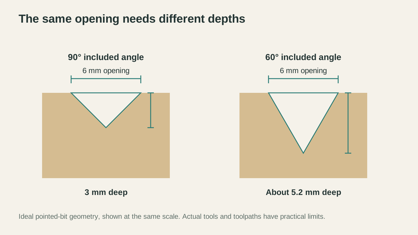
For the same 6 mm opening, an ideal 90-degree V reaches 3 mm deep; a 60-degree V reaches about 5.2 mm. Both sections use the same scale.
Artwork That V-Carves Well
V-carving is only as good as the vectors you feed it. The toolpath math assumes clean, closed shapes, and it gets visibly confused when it does not have them. What you want:
- Closed vector outlines. Every shape should be a closed loop. Fonts already are, which is why text v-carves so reliably.
- No overlaps or duplicates. Two shapes stacked on the same spot, or a path crossing itself, produces double-cut grooves and weird depth spikes.
- Actual stroke width. Line art needs to be drawn as outlined shapes with real width. A zero-width centerline gives the CAM nothing to measure, so it just scores a constant-depth groove.
If you are drawing your own art, keep it simple and bold. If you want something ornate without spending an evening on vector cleanup, Vector Studio generates machine-ready SVG from a text description for 1 credit, and its output is closed, non-overlapping paths, exactly what a v-carve toolpath wants. If your CAM software only imports DXF, run the SVG through the File Converter first, which handles SVG to DXF without a tool-credit charge, no credits required. Downloading the converted file requires an active paid plan.
Once the artwork is sorted, the rest of the sign workflow (layout, toolpaths, fixturing, finishing) is its own topic. Our custom CNC sign walkthrough covers that whole pipeline start to finish.
Info
The same variable-depth geometry powers v-carve inlays, where a plug carved with the same V-bit drops into the pocket for a tight glue line once the fit is dialed in. If v-carving clicks for you, CNC inlays are the natural next step.
Depth Limits and the Flat-Depth V-Carve
Here is the catch nobody mentions until it bites: depth follows width, and width can get silly. A big bold letter with a 40 mm wide stroke asks a 90 degree bit to plunge 20 mm at the centerline. That is deeper than many common V-bits can cut (check your bit's cutting-length spec), possibly deeper than your material is thick, and it looks like a trench, not a letter.
The fix is the flat-depth v-carve, which most dedicated CNC CAM packages offer under one name or another. You set a maximum depth, say 4 mm. The V-bit carves the beveled edge of each shape down to that depth, and everything wider gets cleared out flat at 4 mm instead of going deeper. Most software lets a larger flat end mill do that clearing pass so the V-bit only cuts the bevels.
The result is a pocketed letter with crisp beveled walls: the sharp corners and angled edges of a v-carve, the controlled depth of a pocket. It is the standard approach for large-format carved signs, and a safe bet for how the ones you have admired were made.
Warning
Always check the toolpath preview's maximum depth before cutting wide artwork without a flat-depth limit. A forgotten depth cap on one wide letter is a classic way to carve through the workpiece and into the spoilboard.
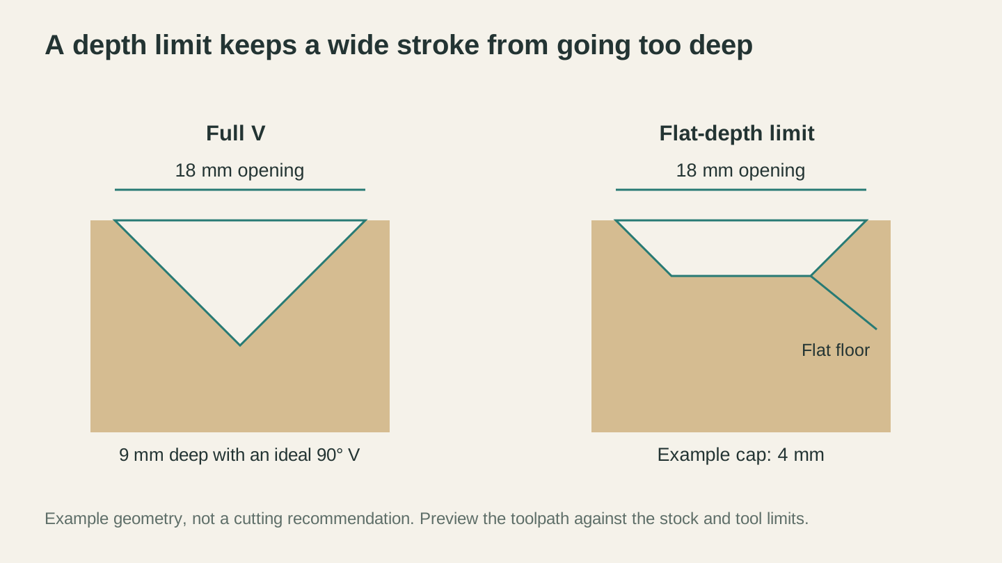
A flat-depth limit preserves the bevel while capping the deepest area. The dimensions shown are a geometry example, not a machine setting.
Wood Choice Matters More Than Usual
V-carving puts fine detail and sloped walls right where wood grain likes to misbehave, so species choice shows up in the result more than it does in ordinary profile cutting.
Tight, even-grained hardwoods carve the cleanest: maple and cherry are the classics, and both hold crisp corners and smooth bevel walls. Open-grained woods like oak and ash can chip out along the grain lines exactly where a fine serif crosses them. Soft woods like pine tend to fuzz in the grooves rather than cut clean. And for painted signs, primed MDF v-carves beautifully because it has no grain at all.
Our wood selection guide for CNC goes deeper on species, but the short version for v-carving: the finer the detail in your artwork, the tighter the grain you want under it.
Common Failure Modes
When a v-carve comes out disappointing, it is almost always one of these:
- Rounded, mushy corners. The signature move of a dull V-bit. The tip is the part doing the delicate corner work, and it is also the most fragile part of the tool. If corners that used to come out sharp start looking soft, the bit is done, not your file.
- Fuzz in the grooves. Usually soft or open-grained wood, sometimes a dull edge or an aggressive feed. A light hand-sanding knocks most of it off; a coat of sanding sealer before carving prevents a lot of it in the first place.
- Over-deep centerlines on wide art. The forgotten flat-depth limit from the previous section. Preview the max depth every time.
- Letters carving fat or skinny. In v-carving, Z zero position controls stroke width, not just depth. Zero slightly too low and every groove cuts wider than designed; too high and the whole carve comes out thin. Zero off the actual material surface, carefully, ideally near the carve area on cupped boards.
- Burn marks or chatter in the bevels. Feeds and speeds, same as any other cut, with the wrinkle that the effective cutting diameter changes with depth. Start from conservative settings and test on scrap; our feeds and speeds primer covers how to dial in from there.
Frequently Asked Questions
Do I need special software for v-carving?
You need CAM software with a v-carve toolpath strategy, which calculates the variable depth from your vectors. Most hobby and pro CAM packages include one. A plain engraving or profile toolpath with a V-bit is not the same thing: it cuts constant depth and loses the whole width-following effect.
Can I v-carve plywood or MDF?
MDF, yes, and it is a favorite for painted signs. Plywood is riskier: the carve exposes alternating glue lines and veneer layers on the bevel walls, which some people like as a striped effect and others hate. Baltic birch gives the cleanest version of that look.
What angle should my first V-bit be?
If you only buy one, buy a 60 degree bit. It handles small and medium lettering well, and small lettering is where v-carving beats every alternative most decisively. Add a 90 for larger signs when a project calls for it.
Feed It Good Vectors and It Rarely Fails
V-carving is one of those rare CNC techniques where the clever part is entirely in the geometry, so once you understand depth-follows-width, the technique itself almost never surprises you. The failures come from dull tips, wrong wood, and messy artwork.
Two of those you control at the bench. The third you can solve in about a minute: describe the design you want in Vector Studio and get a clean, closed-path SVG built for carving, then convert it with the File Converter if your CAM wants DXF. Generation uses credits; conversion does not. Prepare the resulting design in your CAM software before cutting. Downloading the converted file requires an active paid plan.
Related Tools
Ready to try these tools?
Sign up free, no credit card required. Free tools available immediately.
Start Free